


Precision Ag Update - October 2026
Using Drones to Measure Crop Height Across the Field
Written by: Md. Raihanul Islam and Ali Bazrafkan, October 2026
Summary
How tall a crop grows says a lot about its health and yield potential. Hand measurements are slow and miss most of the field, satellite pictures are too blurry to show small height differences, and drones with laser scanners are expensive. We tested a cheaper option, an ordinary drone with its built-in color camera, on a small wheat plot in north-central Montana. It produced a detailed crop height map that showed clear differences in wheat height across the plot, along with a few errors that growers should know how to spot.
Methods
The drone flies back and forth over the field, taking photos that overlap like shingles on a roof (Figure 1). A drone-mapping program finds the same small details, such as leaf tips or soil clods, in photos taken from different spots and works out how high each one is, much like your two eyes judge distance. Millions of these points form a 3-D model of the field. Subtracting the ground from the top of the crop gives plant height at every spot, producing a crop height map (Figure 2).
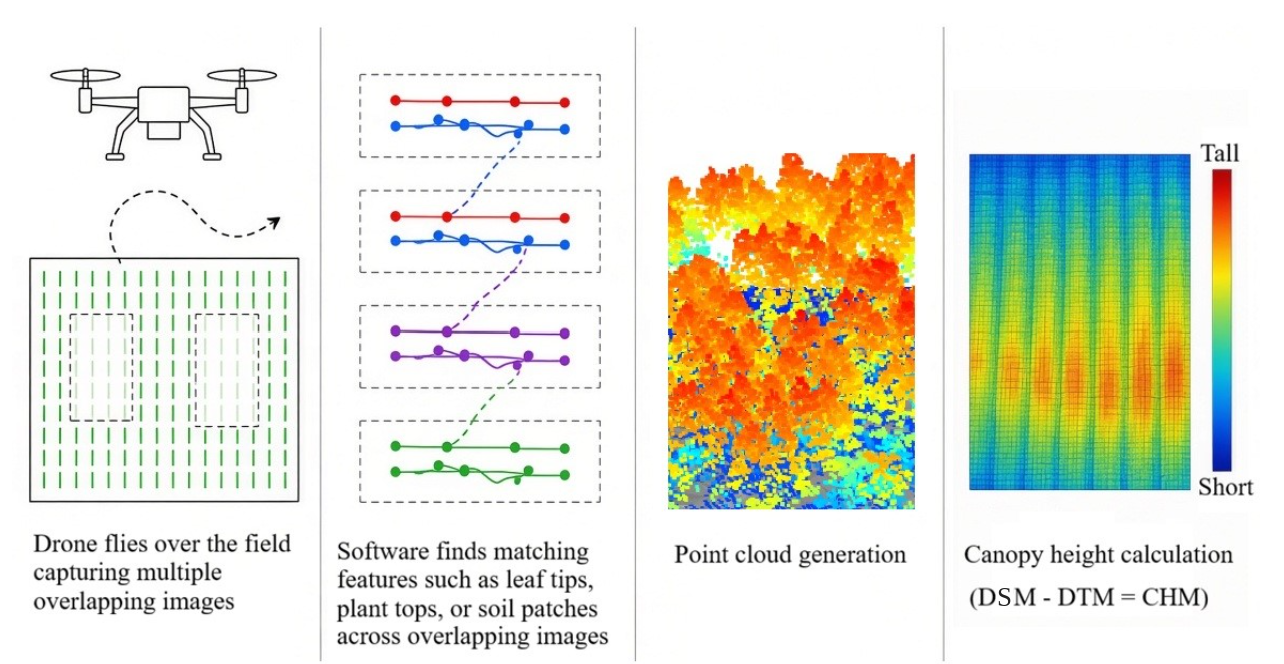
Figure 1. How crop height is measured with a drone: overlapping photos are taken, the same details are matched across photos, a 3-D model is built, and the ground is subtracted from the top of the crop. In the figure, top of crop (DSM) minus ground (DTM) equals crop height (CHM).
We flew the drone over a small wheat plot near Havre, about 20 × 9 ft (6.3 × 2.9 m). The photos were stitched into one sharp picture in which each dot covers about ¾ inch (1.9 cm), the width of a penny (Figure 3). To make the height map easier to read, we also averaged the height in squares about 2½ ft (0.79 m) on each side and colored them like a traffic light: green for roughly the tallest third, yellow for the middle third, and red for the shortest third.
 Figure 2. The wheat plot shown three ways, from bottom to top: its 3-D shape, the height map,
and the average height in each square.
Figure 2. The wheat plot shown three ways, from bottom to top: its 3-D shape, the height map,
and the average height in each square.
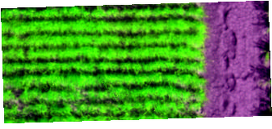
Figure 3. Drone picture of the wheat plot. Colors were adjusted so the wheat rows (green) stand out from the bare soil (purple).
What We Observed
The height map shows where the wheat grew well and where it fell behind (Figure 4a). Darker green means taller plants. Figure 4b works like walking from i to ii with a measuring stick, except the drone measures every few inches. Most of the wheat was between ground level and 1 ft (0.3 m) tall. The low readings include bare soil between rows. The 3 ft (1.0 m) and 1½ ft (0.5 m) readings at the ends of the line are likely edge errors, so always check the map against the field before acting on it.
The traffic-light map (Figure 5) turns this into a scouting guide. Green marks the best growth, yellow is average, and red is where to walk first to look for poor emergence, dry spots, weeds, or soil problems. Heights are compared within the plot, so the approach works in any field. The tallest square, in the upper-left corner, averaged 0.92 m (3 ft).
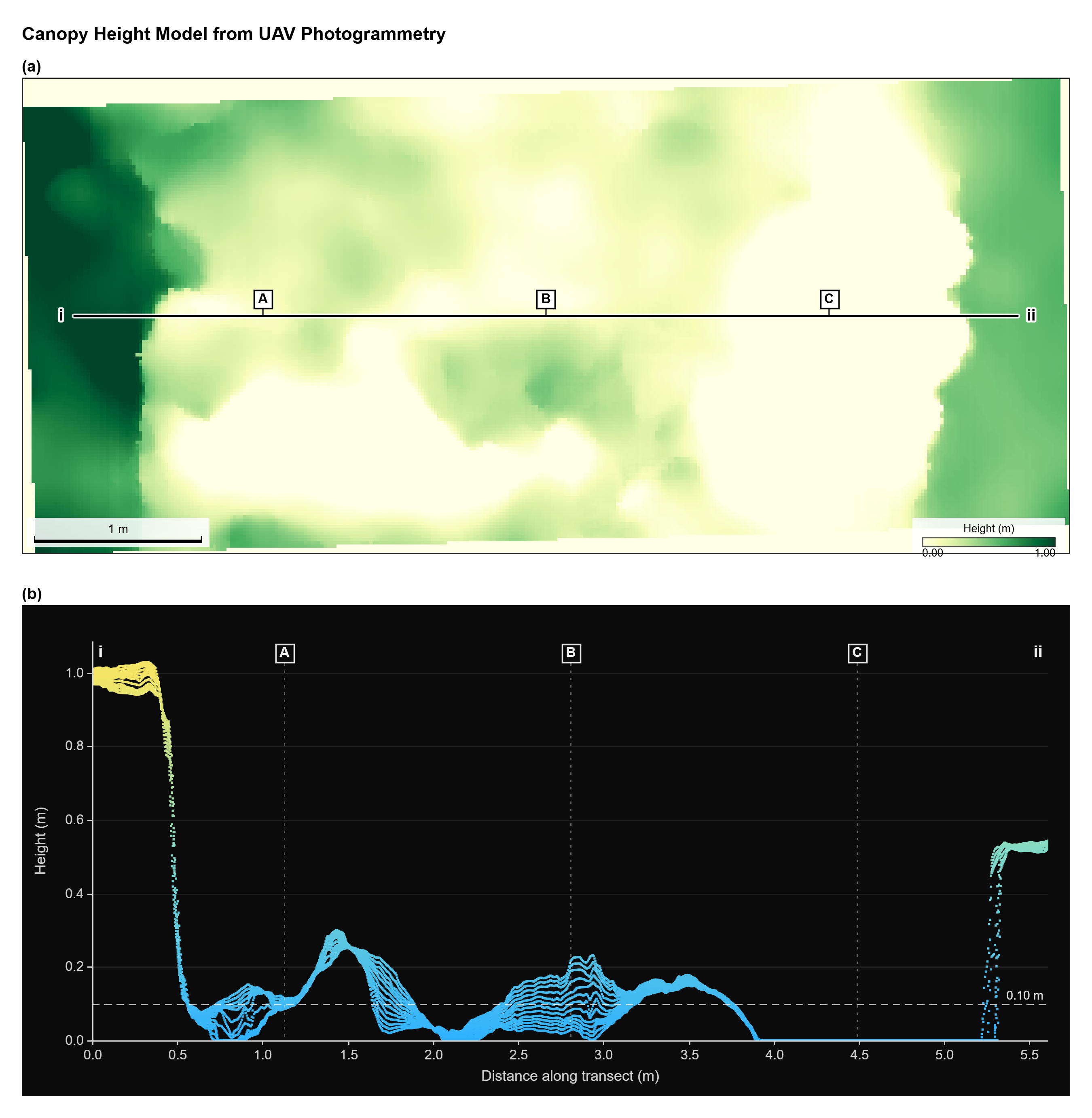 Figure 4. (a) Height map of the wheat plot; darker green is taller. (b) Plant height along the
line from i to ii. The dashed line marks 4 inches (0.10 m); letters A–C mark the same
places in both parts
Figure 4. (a) Height map of the wheat plot; darker green is taller. (b) Plant height along the
line from i to ii. The dashed line marks 4 inches (0.10 m); letters A–C mark the same
places in both parts
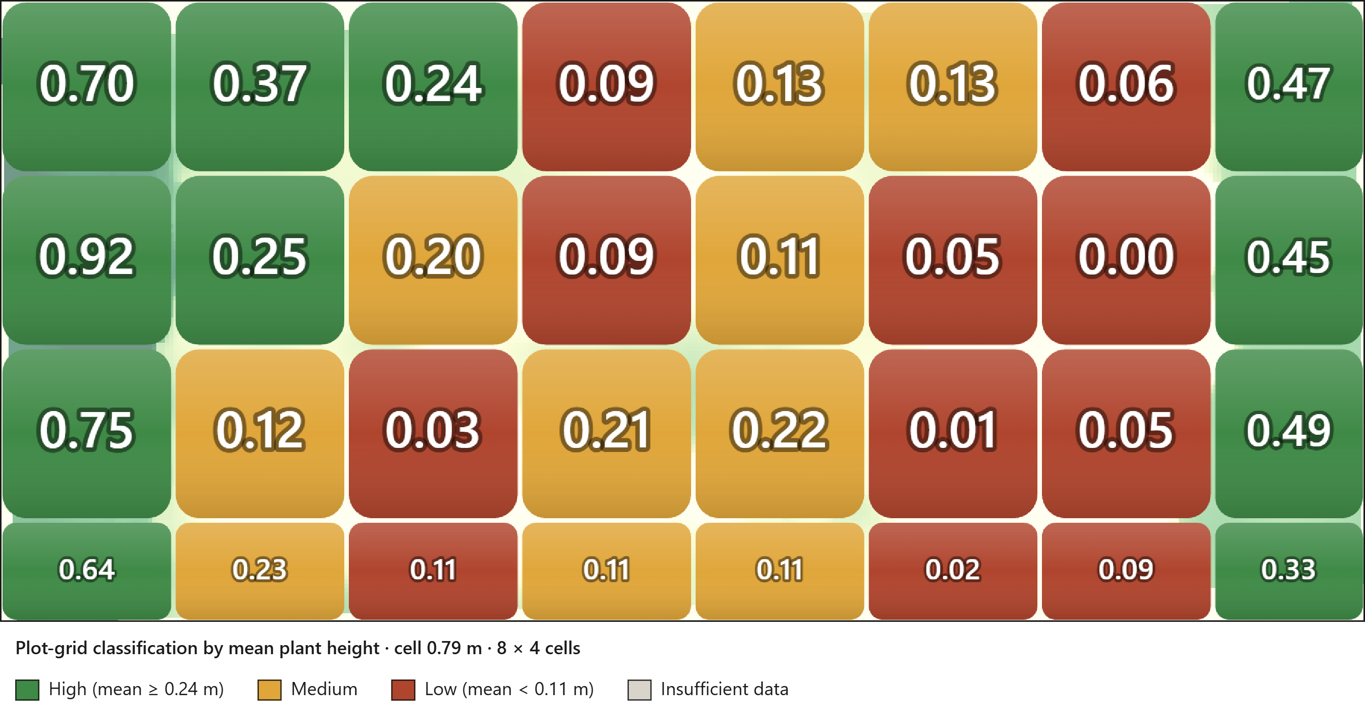
Figure 5. Average plant height in each square, in meters (0.30 m is about 1 ft). Green: 0.24 m (9½ in) or taller. Red: under 0.11 m (4¼ in). Yellow: in between. Because of rounding, two squares showing 0.11 can differ in color.
Implications
For growers, this example points to four practical lessons:
- See the whole field, not just a few spots. A regular drone with its built-in color camera can show how crop height changes across a field, which a few ruler measurements would miss.
- Scout with a purpose. Averaging the map into color-coded squares turns it into a simple scouting map. Instead of walking the field at random, go straight to the red (short) areas and find out why. The cause might be poor emergence, water stress, nutrient deficiency, weeds, disease, insects, compaction, or soil differences.
- Find patterns that repeat. Short areas that line up with hilltops, low spots, saline patches, old fence lines or equipment passes point to problems you can manage. Comparing the height map with yield maps, soil maps or past satellite images shows whether the same areas underperform year after year. Those areas are good candidates for management zones.
- Compare treatments on your own farm. Height maps give a quick, whole-strip comparison of on-farm strip trials, such as varieties, seeding rates, nitrogen rates or fungicide versus no fungicide.
Acknowledgements
We thank Dr. Ricardo Pinto and his team at the Havre Research Extension Center for their support with data collection. We also thank Dr. Sue Mondal and her team for their support with wheat planting and management.
Get Connected & Learn More

Dr. Ali Bazrafkan
Assistant Professor, Precision Agriculture

Md. Raihanul Islam
PhD. Student